The product had outgrown its homepage. So I rebuilt it.
Cash App had outgrown its homepage. Here's how I rebuilt the visual system to restore trust and reflect the real product.
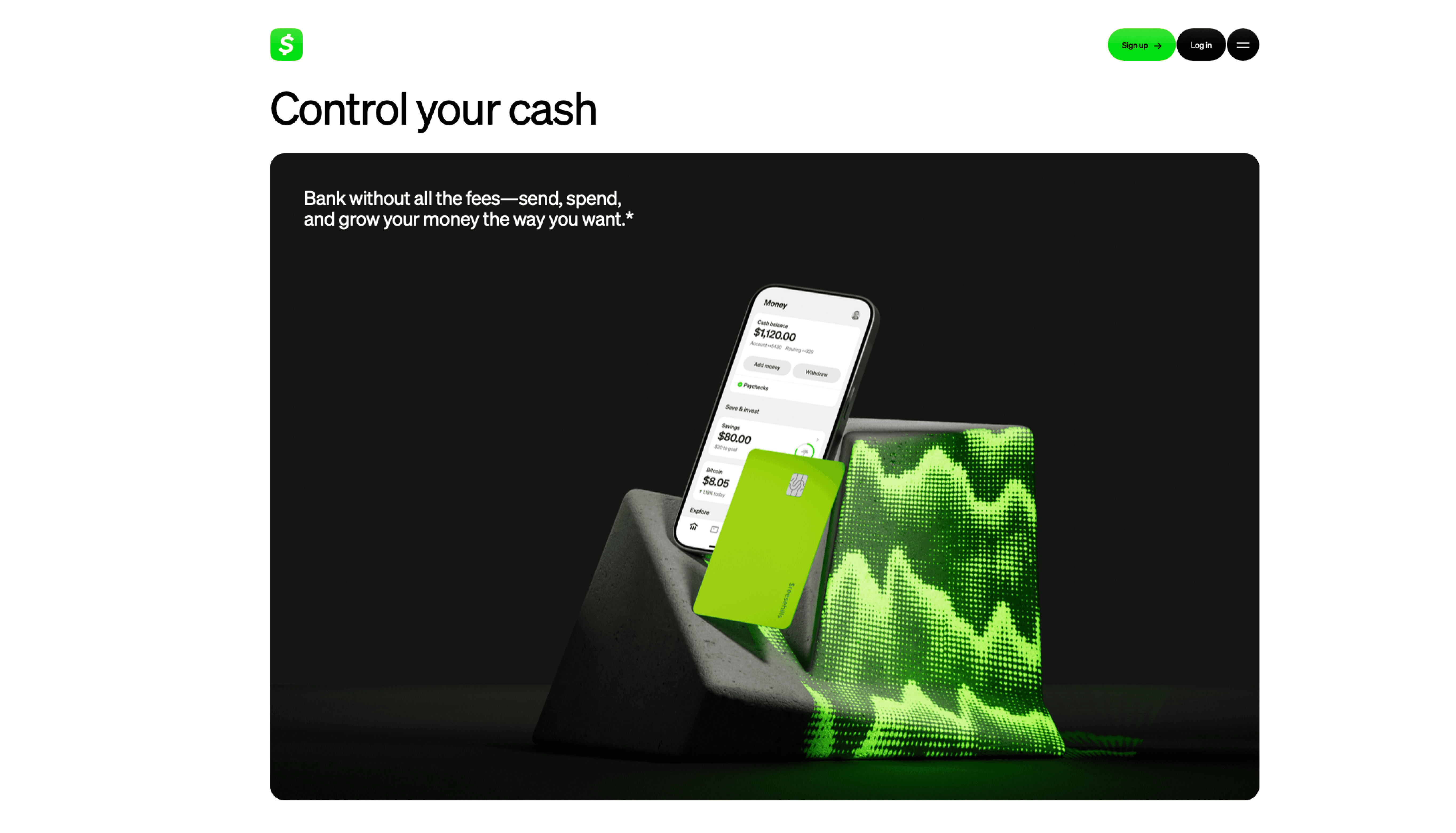
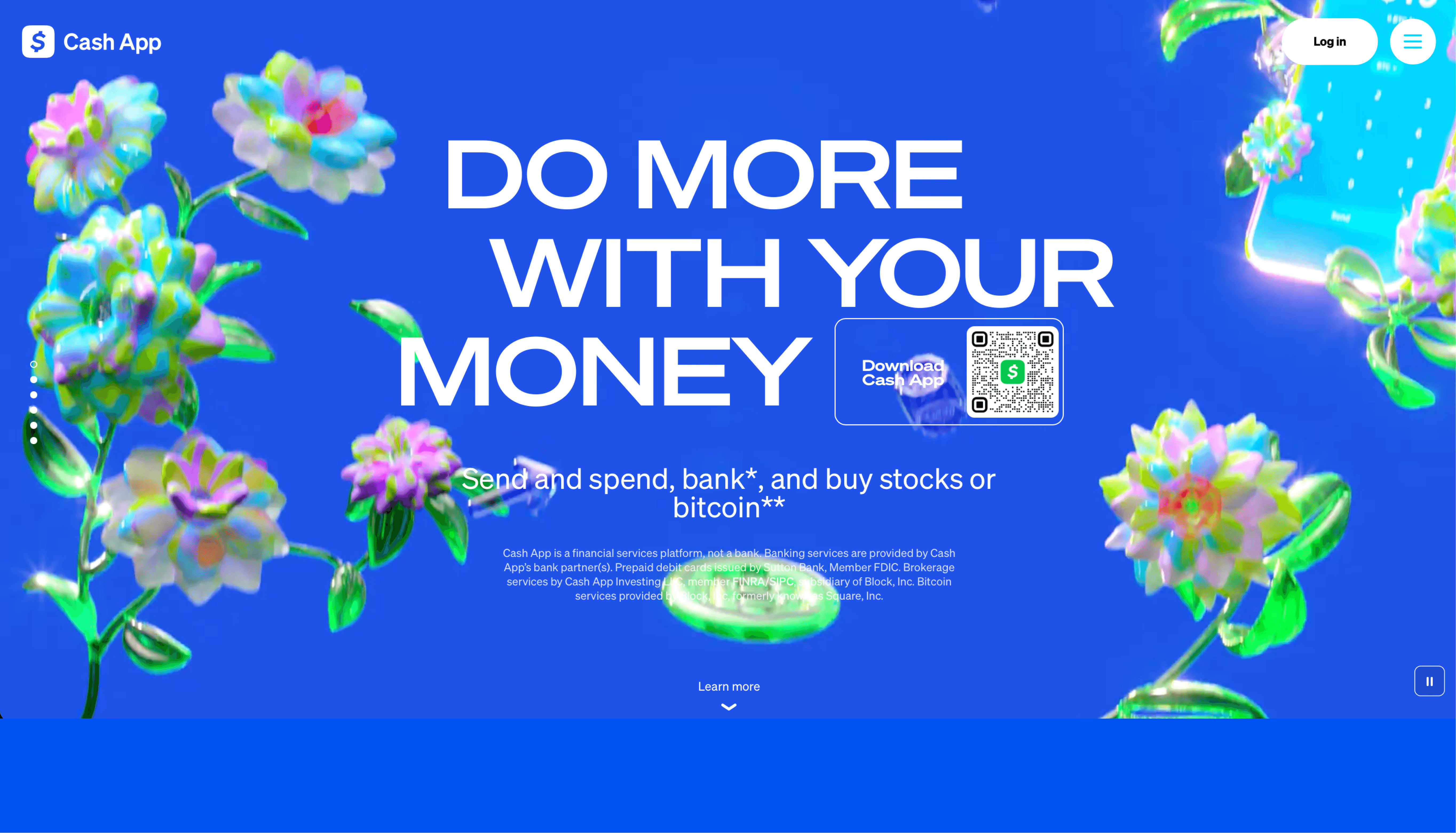
Drag to compare — the dated Oct 2024 homepage vs. the rebuild.
The homepage was telling an old story
By October 2024, Cash App had spent years shipping new products and expanding what the brand could do. But the homepage hadn't kept up. The visuals felt dated closer to the scrappy peer-to-peer app of years past than the full financial platform Cash App had become.
That gap matters more than it looks. A homepage is the first handshake. When the visuals feel dated, visitors assume the product is too and trust erodes before anyone reads a word.
“A homepage is the first handshake. Dated visuals tell visitors the product is dated too.”
The diagnosis: a trust and gap
I audited the homepage the way a new visitor experiences it, in five seconds, before a single feature is read. Two problems surfaced fast. First, the visual language didn't signal trust: for a company asking people to move and store their money, that's the whole game. Second, the page under-sold the product, years of new features simply weren't represented properly.
So I framed the work around three goals: rebuild the visuals to communicate trust, modernize the system so it reflects today's product, and showcase the new features the old page ignored without losing the warmth that makes Cash App feel like Cash App.
The approach: trust, built visually
Trust in a financial product isn't communicated with a badge that says trusted. It's communicated through craft typography that feels considered, spacing that feels calm, motion that feels intentional, components that feel engineered rather than assembled. I rebuilt the homepage's visual language around that idea.
Every surface was updated to a cohesive, modern component system: consistent type, refreshed color and imagery, and reusable blocks that could flex across the new product story. The result reads as more credible and more current a homepage that finally matched the sophistication of the product behind it.
“Trust isn't a badge you add. It's the sum of a hundred small craft decisions the visitor feels but never names.”
The execution: a system, shipped fast
A staff-level designer doesn't just hand off a redesign, they build a system the team can keep using, and they do it fast enough to matter. I rebuilt the homepage as a set of modern, reusable components rather than a one-off page, so the new visual language could extend across future campaigns and products.
To move quickly, I leaned on agentic AI workflows, Claude and Vercel-style component generation wired into my process to explore more directions, generate production-ready building blocks, and document them as I went. Cleaner handoffs, faster iteration, no drop in the quality bar.
Live Figma file — the homepage system and components.
Why this matters for your team
Taste is table stakes at this level. What you're really hiring is leverage someone who can turn a design decision into a business outcome, and leave the team better equipped than they found it.
The Cash App homepage is one proof point: a dated page rebuilt to communicate trust, reflect the real product, and convert better as a result. The component system is another a force multiplier that compounds across everything the team ships next. That's the bet at staff level: not a designer who executes a brief, but an operator who writes it, defends it with craft and outcomes, and ships it faster than you expected.
“You're not hiring someone to execute the brief. You're hiring someone to write it, defend it, and leave the team better than they found it.”